
Understanding Analytics in Admittee
The Trends tab in Reports shows total revenue, hours, and events for any date range, with charts by time period, facility, event category, and revenue stream.
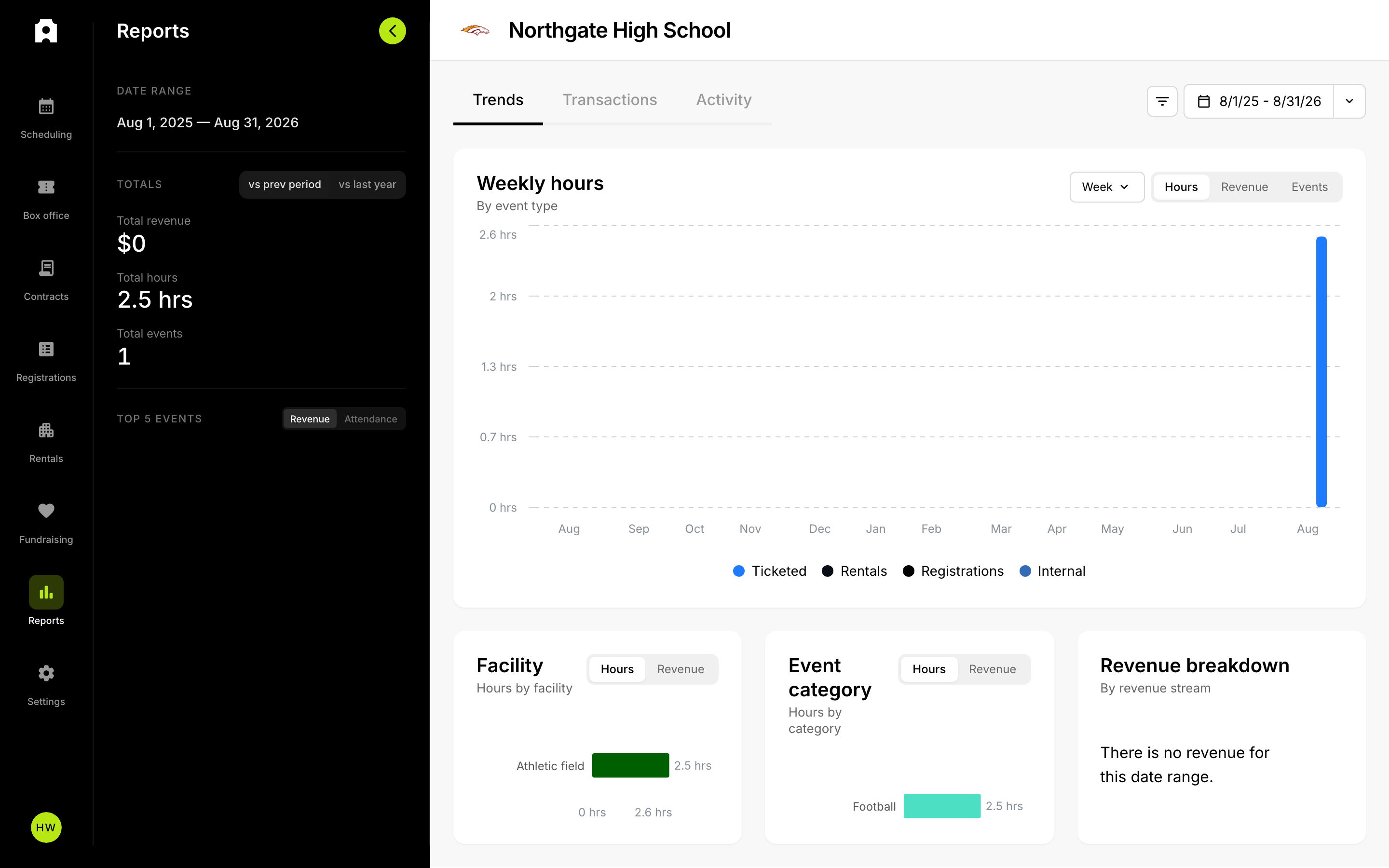 Analytics and metrics in Reports.
Understanding Analytics in Admittee
Admittee's analytics live on the Trends tab of the Reports section. For any date range you pick, Trends shows your total revenue, total scheduled hours, and total event count, along with charts that break that activity down over time and by facility, event category, and revenue stream. This is the deeper reference for the Reports area; for a first-time overview, see Understanding the Finances Section.
Where do I find analytics?
Open Reports from your dashboard, then choose the Trends tab. Everything described below appears there. Reports also has a Transactions tab, which lists individual line-item sales instead of summaries, and an Activity tab; see Exporting Reports for how the Trends and Transactions tabs differ.
How do I set the time period?
A date range control drives every number and chart on the page. You can:
- Pick a preset such as This month, This quarter, This school year, This fiscal year, Last month, Last quarter, Last school year, Last fiscal year, Month to date, Quarter to date, or Year to date.
- Choose Custom date range and select your own start and end dates on the calendar.
You can also apply a facility filter to limit every total and chart to a single facility, or leave it on All facilities. School-year presets follow your institution's configured start month, and all dates display in your institution's time zone.
What do the totals show?
A summary reads out three headline numbers for the selected range:
- Total revenue — net revenue across all streams
- Total hours — scheduled hours across your events
- Total events — how many events fall in the range
What are the Top 5 events?
The summary also lists your Top 5 events for the range. Use the toggle to rank them by Revenue (net revenue across all streams for that event) or Attendance (tickets sold). Select any event in the list to jump to its detailed report.
What does the main activity chart show?
The largest chart plots activity over time, broken out by event type. Two controls shape it:
- Switch the metric between Hours, Revenue, and Events.
- Switch the interval between Day, Week, and Month.
Each bar covers one interval, and the segments within a bar show how much each event type contributed. Select a bar to open a breakdown for that specific period.
How do the Facility and Event category charts work?
Two charts rank your activity by where and what:
- Facility — hours or revenue per facility. Toggle between Hours and Revenue.
- Event category — hours or revenue per category, with the same Hours/Revenue toggle.
Select a bar in either chart to drill into the individual events that make up that facility or category for the selected range, then select an event to open its detailed report. Because an event booked into more than one facility counts toward each facility it uses, per-facility totals can add up to more than your unique event totals; the chart notes this when it applies.
How do I read the Revenue breakdown?
The Revenue breakdown chart splits your net revenue by revenue stream:
- Tickets
- Passes
- Registrations
- Donations
- Rentals
- Concessions
- Contracts
Select any stream's bar to see which events, or which opposing schools in the case of contracts, contributed to that stream over the selected range.
How do I see concession sales for an event?
When you open an individual event's detailed report, the reports table has a Tickets / Concessions toggle. Switch to Concessions to view that event's concession-stand sales on their own, separate from ticket sales. The toggle appears on desktop; on a smaller screen the event report shows graphs instead.